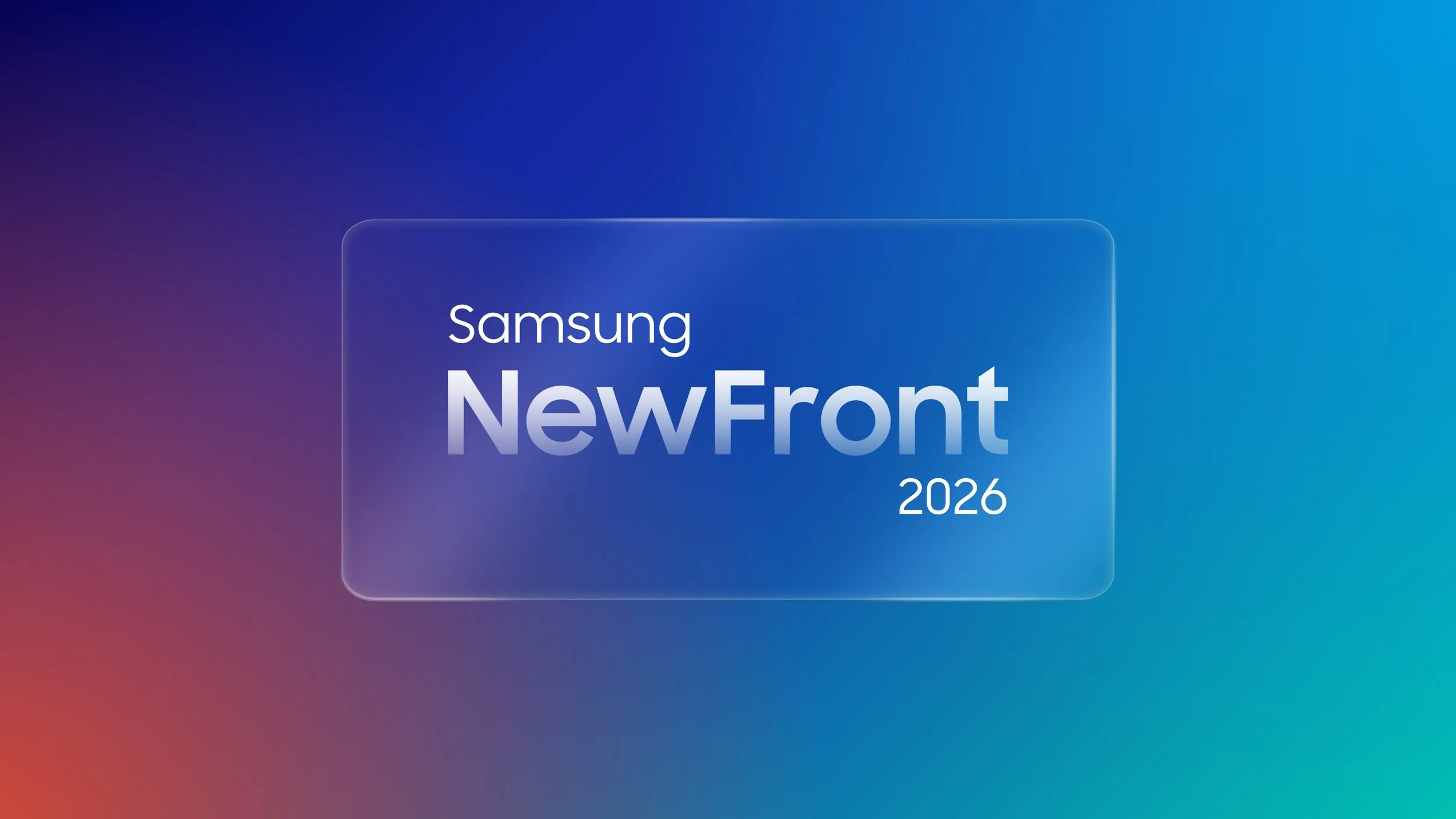
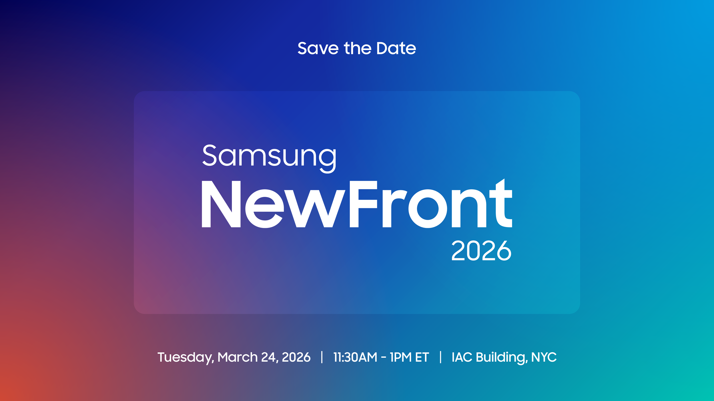
Samsung New Front
Event Motion Branding System
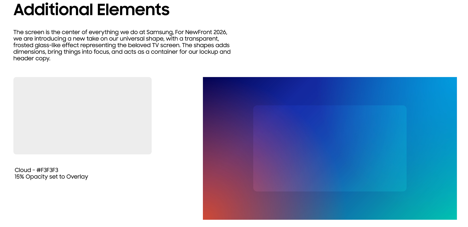
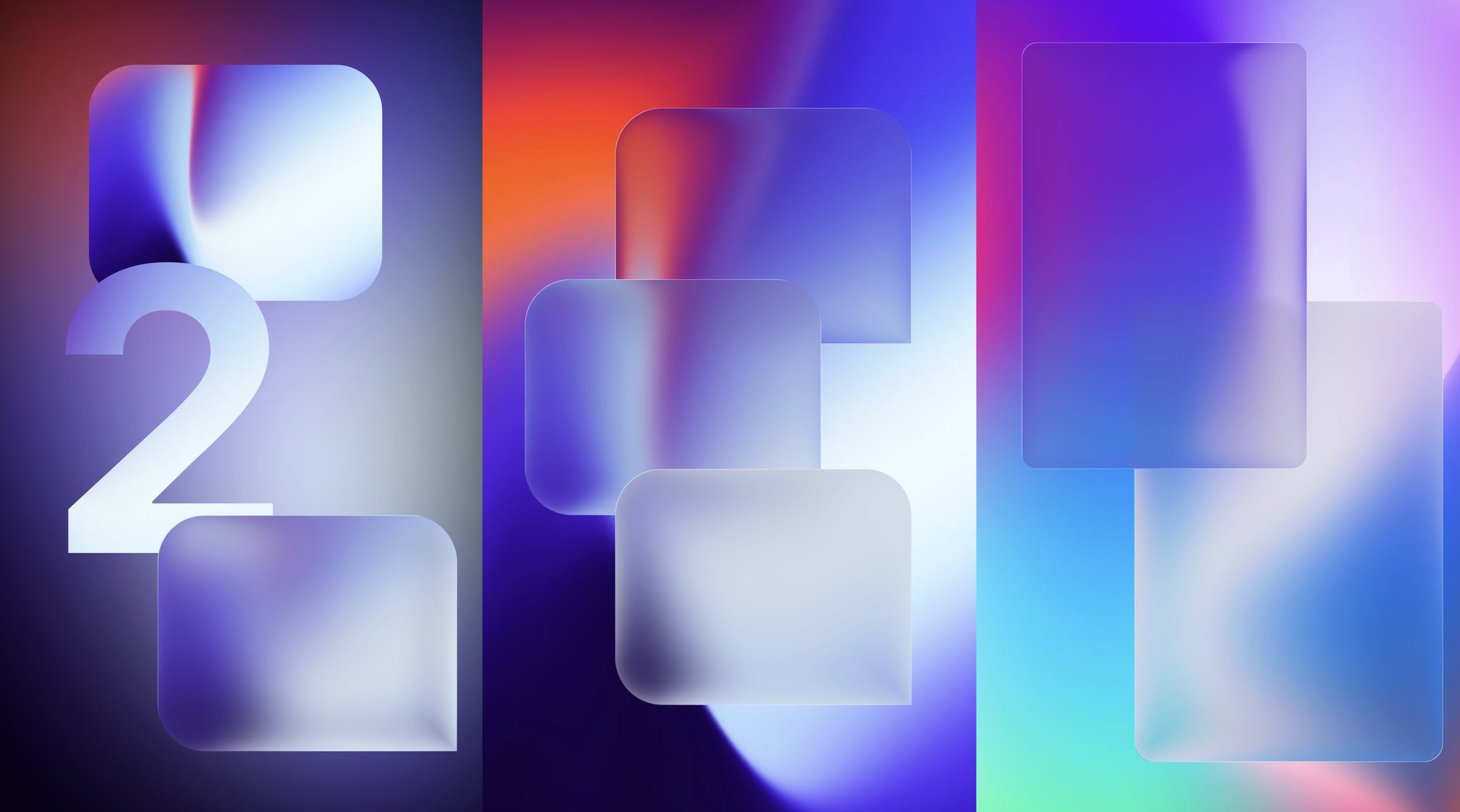
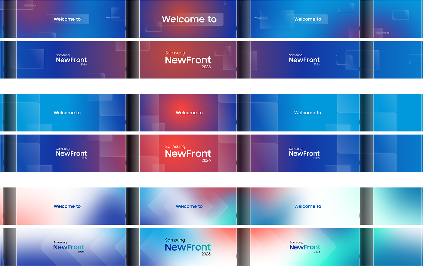
Partnering with the Samsung creative team, our approach was rooted in simplicity. We stripped the system back to a single, powerful conceptual device: one of Samsung's most iconic brand elements — the screen. Its distinctive, rounded-rectangle form became the visual and conceptual anchor of the entire event identity, acting as a framing mechanism that directed focus to Samsung's key conference messaging and brought an immediate sense of brand recognition to every surface it touched.
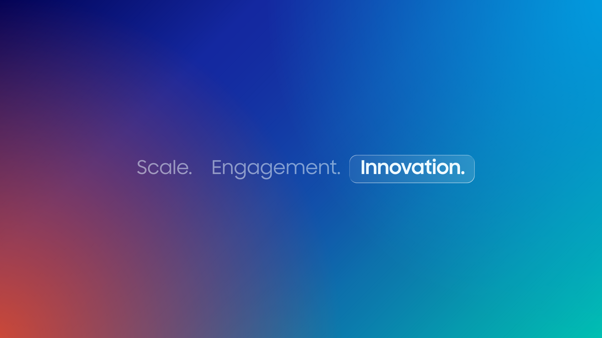
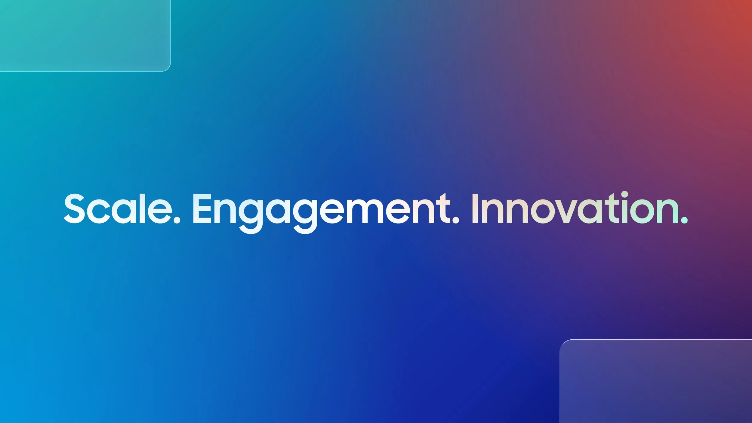
From this singular idea, we built a motion language that felt considered and calm — purposeful motion design, clean, clear typographic choreography, and a restrained visual system that let the content breathe and the messaging land. Ultimately, adding sophistication and delight as an emotional backdrop to the heroes of the conference, the speakers, and the audience.
The system deployed seamlessly across the full live event environment — a city block long stage screen, breakout screens, and environmental displays — unified by that one simple shape, gradient & brand font consistently in motion, consistently on brand.
The result was an event identity with a real conceptual backbone. One idea, expressed everywhere, with nothing wasted.
Visual Inspiration
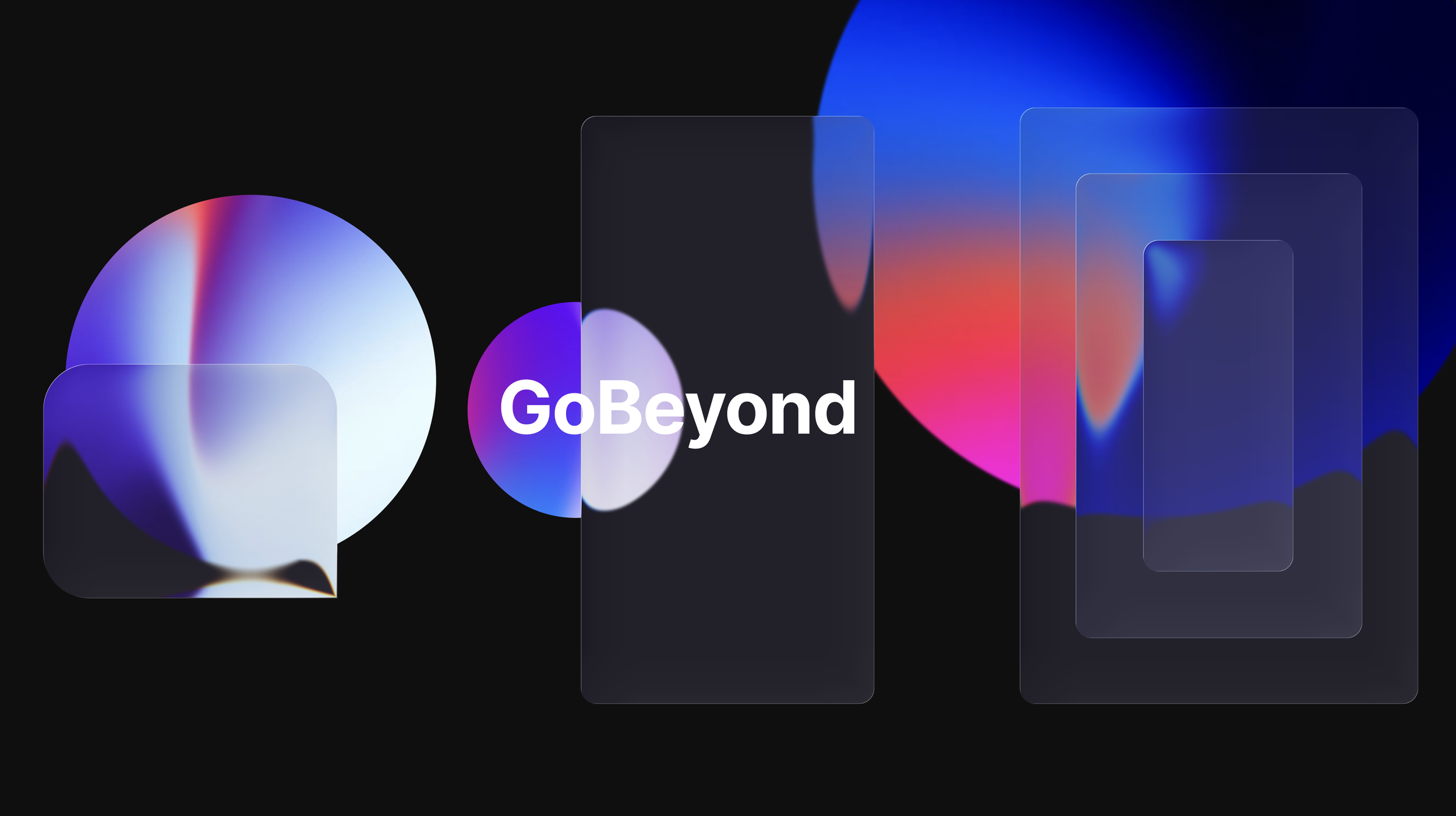
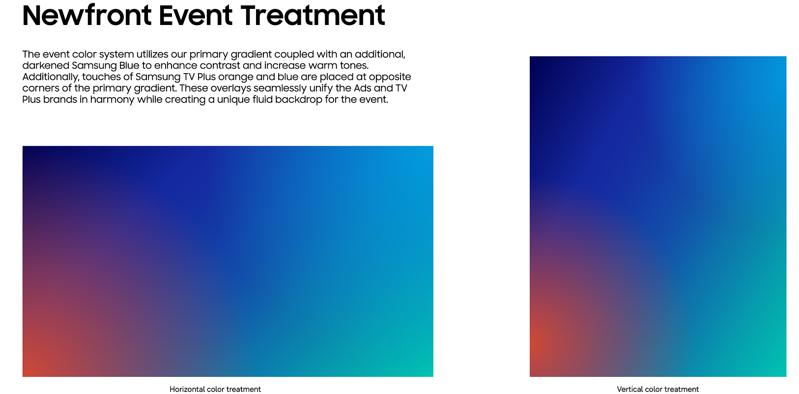
Our visual direction drew inspiration from the interplay of gradients and glass — refraction and dispersion, becoming a conceptual lens through which Samsung's messaging could find focus. The gradient's inherent vibrancy was treated not as decoration, but as a living, moving representation of the intersection between emotion and data: fluid, dynamic, and deeply human. Glass, meanwhile, spoke to something more elemental about the Samsung brand — its clarity, its precision, its premium electronics experience refracted into something you could almost feel through the screen. Together, these two forces created a visual language that was at once technically considered and emotionally resonant.
The Design Process


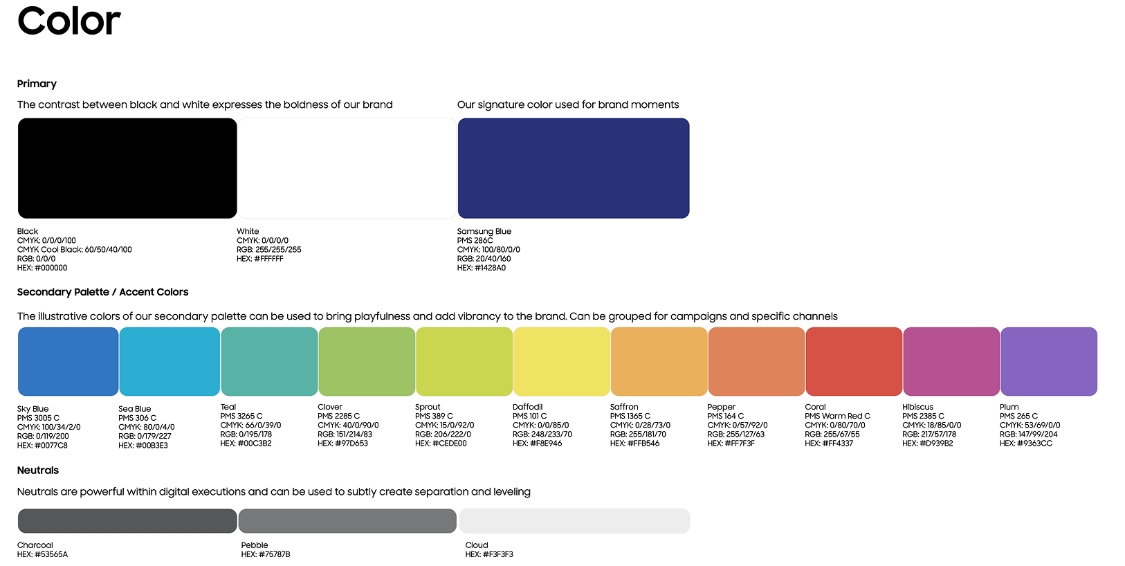
Our visual design process was built around three deliberate pillars: the gradient, the glass screen device, and the Samsung brand font. Every decision was intentional and strategic, guided by a single governing question — how far is far enough? We carefully calibrated how hard to push the vibrancy and movement of the gradients, and how pronounced to make the glass screen's presence in space, always pulling back to the same north star: what feels fresh, yet unmistakably Samsung. The goal was to evolve the aesthetic without destabilizing brand confidence — to introduce something new while honoring what audiences already recognize and trust. Equally important was restraint. The visual world needed to set a mood and create atmosphere without ever competing with the speakers or overshadowing the event content itself. Bold enough to own the room, disciplined enough to serve it.
The Design Direction
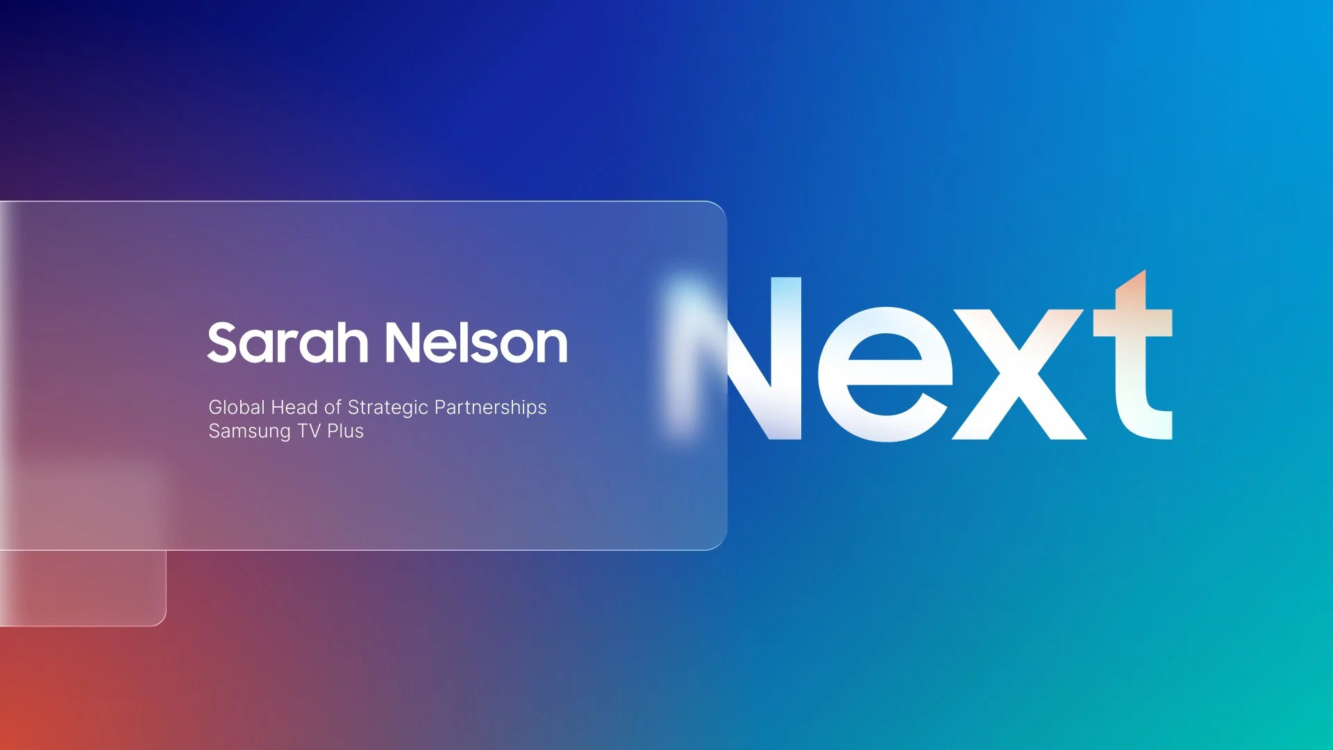
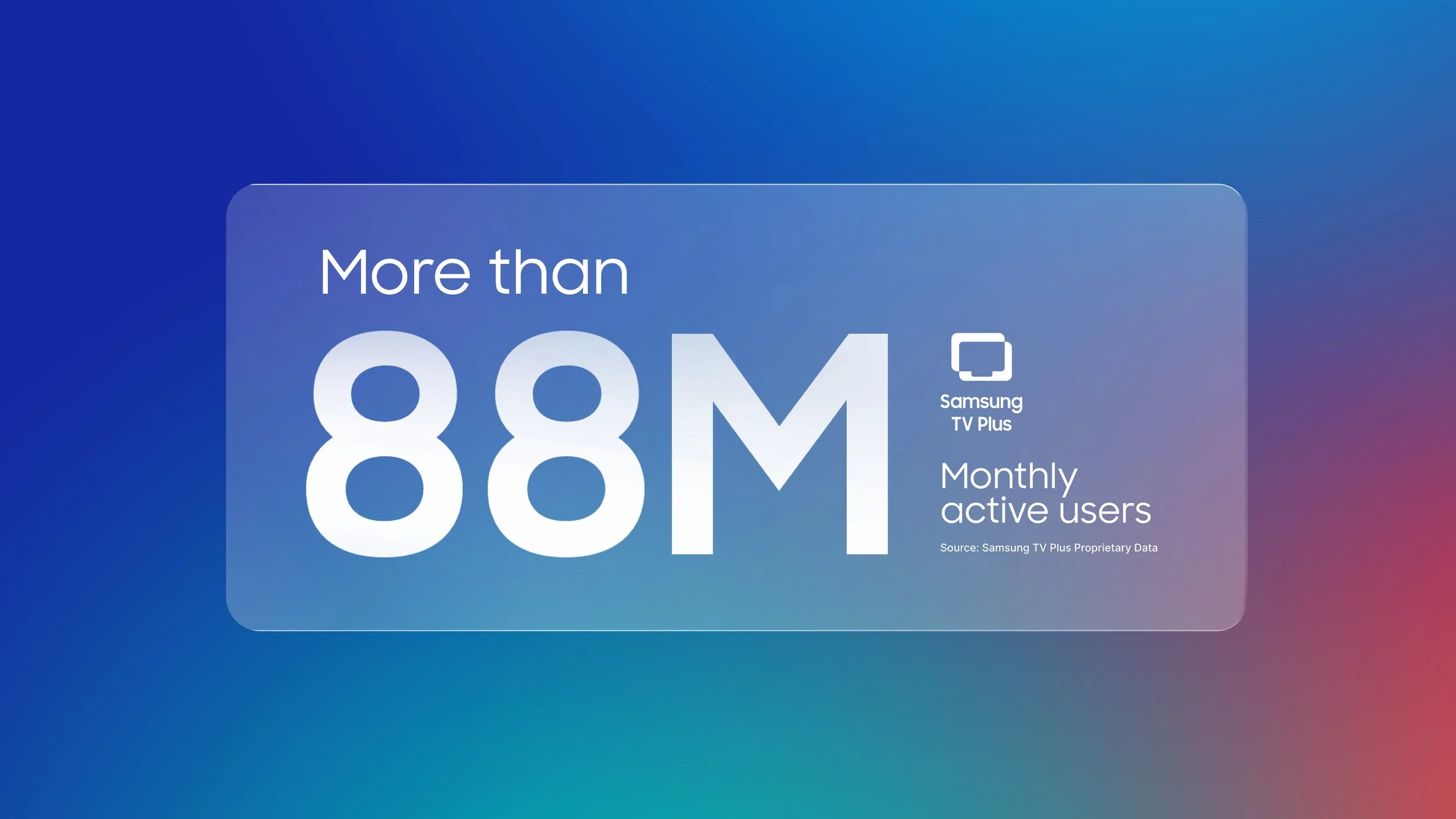
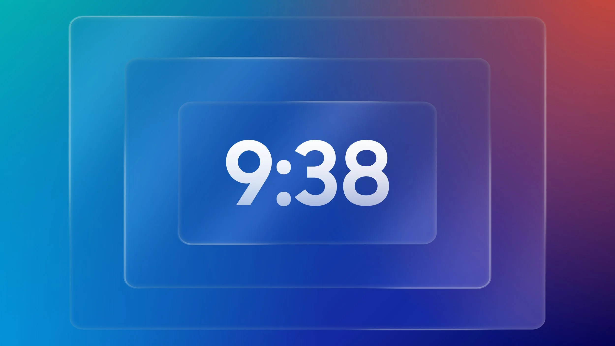
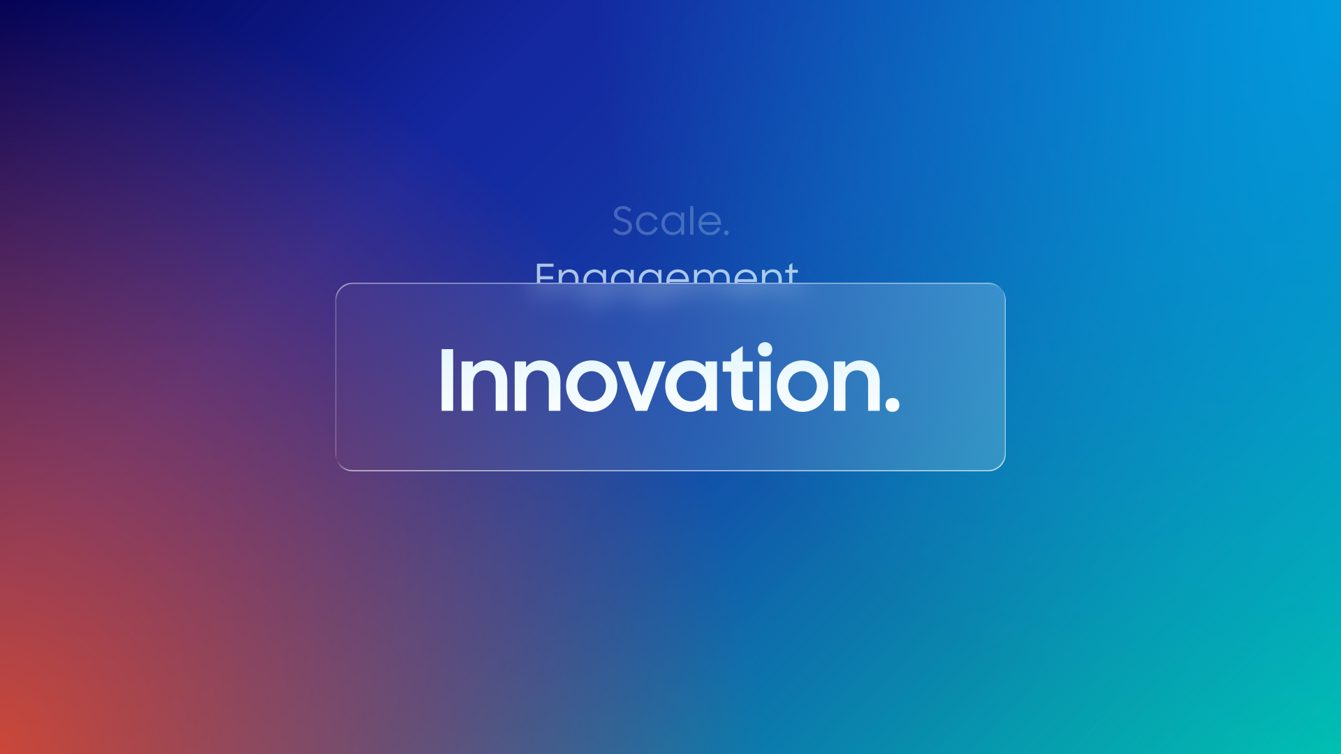
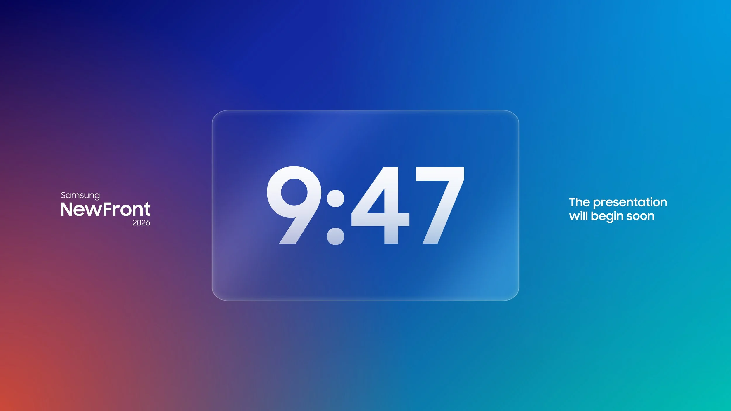
After thorough exploration, the design direction emerged from a deliberate choice to honor the existing static branding — staying close to its established visual language rather than departing from it. To elevate the work beyond a straight translation into motion, a beveled glass treatment was introduced on the screen element, adding a layer of emotional sophistication and tactile refinement. This single detail became the cornerstone of a cohesive motion system: simple, considered, and consistently applied across every touchpoint.
Sizing & UX
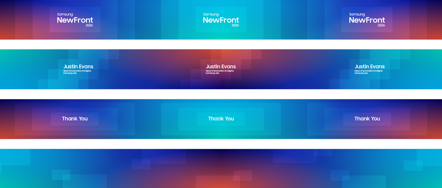
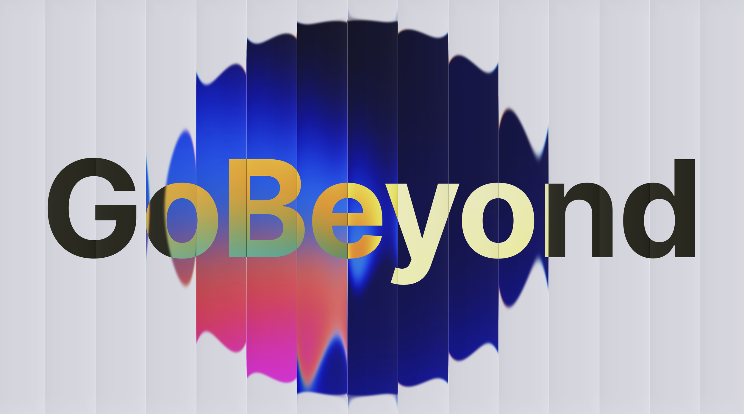
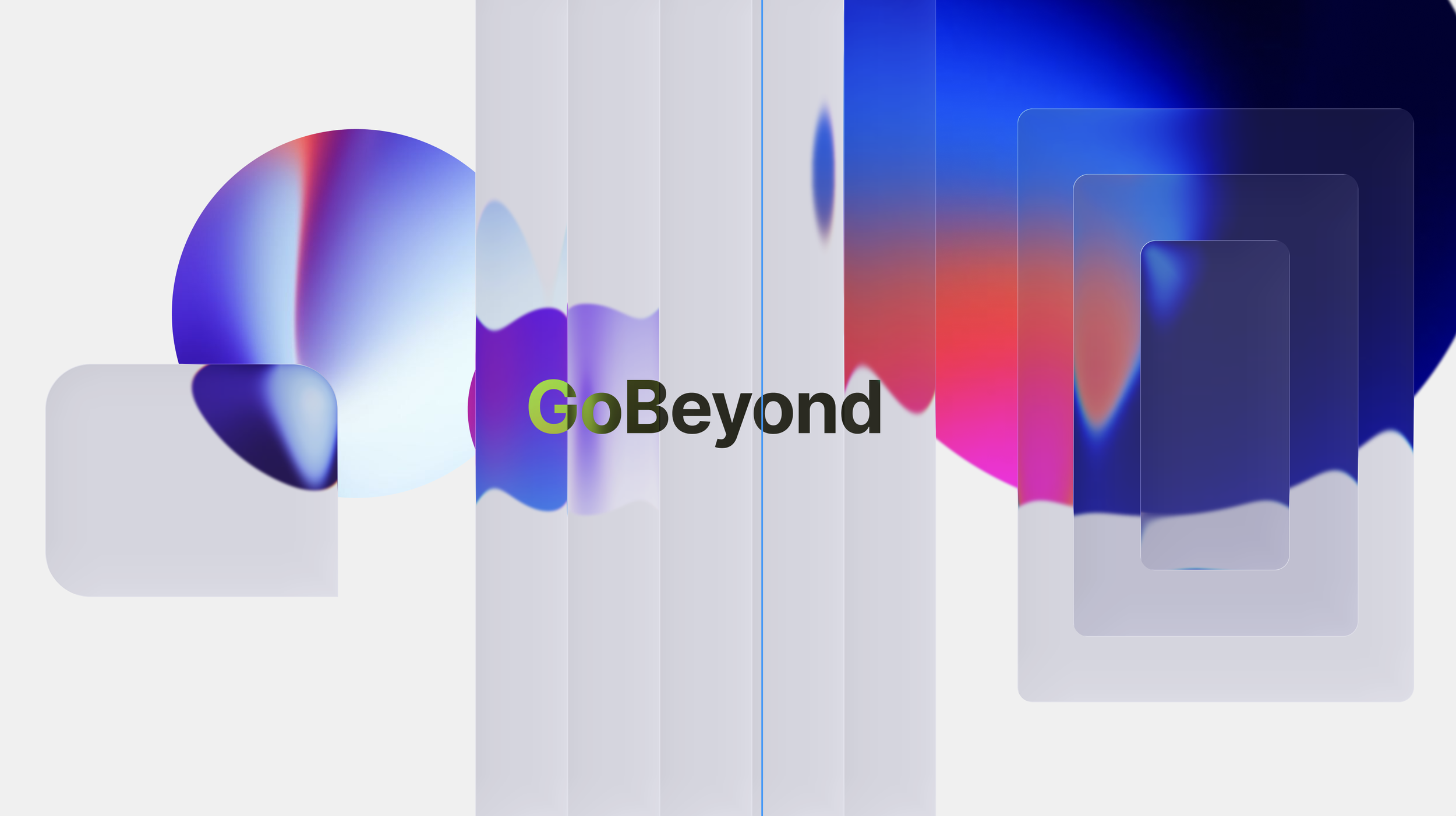
With the design direction established, the work quickly turned to the unique challenges of applying the system to Samsung's ultra-wide, city block-spanning screen. At that scale, conventional layout thinking breaks down entirely — viewers positioned on either end of the room simply couldn't see the full picture. The solution came through a deliberate use of mirrored imagery and strategic repetition, ensuring the content read powerfully and completely from any vantage point in the space, regardless of where a viewer was standing.
A second challenge came from the technical constraints of the screen's projection system itself, which couldn't support the kind of quick, snappy motion that typically drives energy in motion design. Rather than fight the limitation, the approach leaned into it — keeping movement slow and considered while letting the visuals carry the weight. Bold, vibrant imagery and a strong graphic sensibility kept the work feeling alive and commanding, holding viewer's attention through sheer presence rather than pace. The result was a system that felt both technically resolved and visually captivating at an extraordinary scale.
Motion
The animation style that emerged for Samsung was one of quiet confidence — a system built on simple, refined easing that never rushed or demanded attention, but instead invited it. Motion was smooth and unhurried, with text revealed through careful, focused moments that gave each message room to land. The beveled glass elements slid slowly and deliberately, a treatment that was as much an emotional choice as a technical one, transforming a hardware constraint into a visual signature that felt intentional and sophisticated.
Across the board, the system was designed to breathe — to let the visual language settle and resonate rather than compete. Nothing overstayed its welcome, and nothing felt forced. This restraint was purposeful: by keeping the motion calm and the aesthetic consistently polished, the stage was set not for the screens to lead, but for the people to. The speakers, the presentation, and the audience were given space to carry the experience with humanity at the center — the motion existing in service of the moment, never in spite of it.