Improving Intonation With Google


Motion, Animation & Workflow
The emotion came to life through animation—but this wasn’t a traditional workflow. Working with Google, we built a system that linked motion design directly to code.
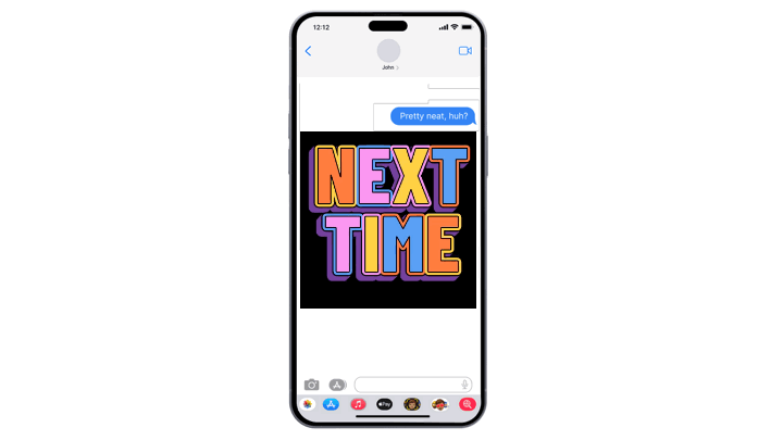
Each emotion was animated in After Effects using live text, then translated into Android code through JavaScript—so every final animation was generated and rendered live in-app.
Google wanted to solve a simple but tricky problem: how to make typed words match their tone.
We designed over 225 expressive text styles using Google typefaces, built into Android’s keyboard to add matching emotion and personality to the meaning of messages. The result: a fun, scalable system that lets words look and feel the way they’re meant to sound.
An Emotion Study
To capture the right feeling behind each word, we explored how tone, sarcasm, and nuance show up in digital communication. The goal was to make each animation feel authentic—something users would want to use every day. This study helped define both the look and emotional depth of every word.
Design & Prototyping
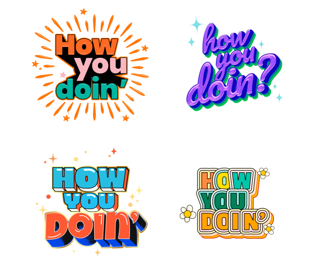
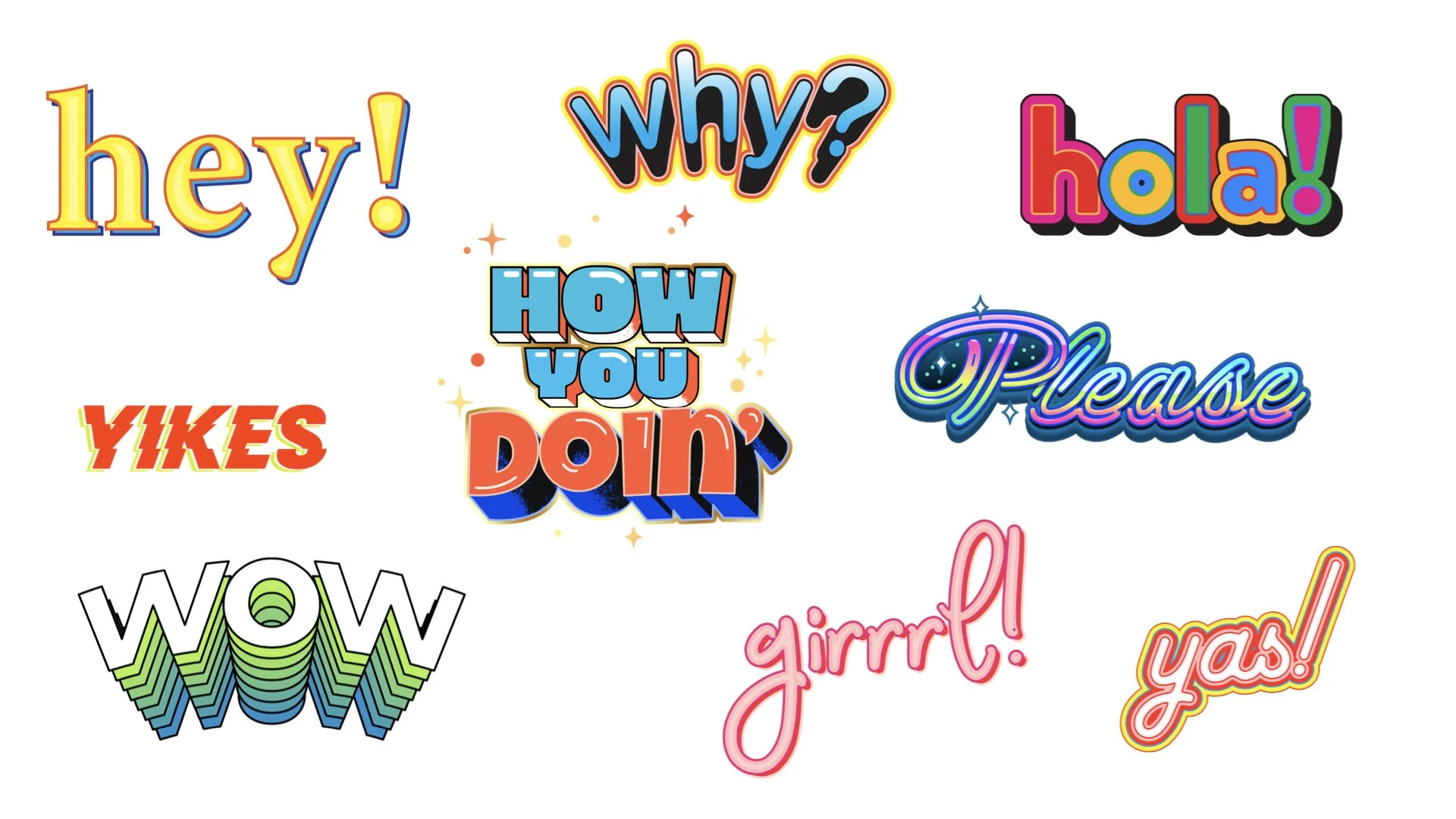
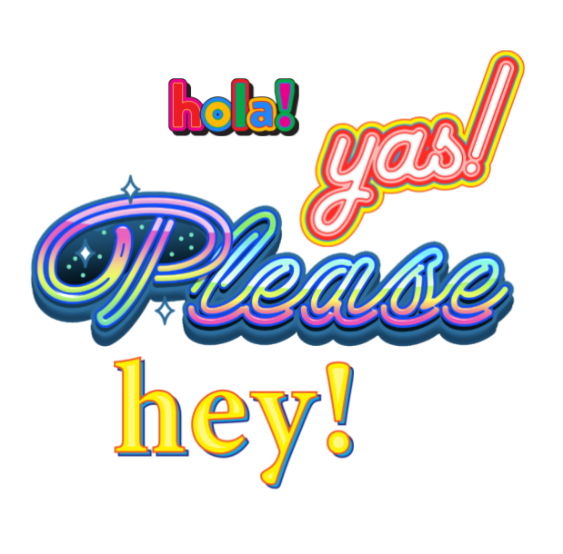
To match each word with the right emotion, we explored many visual styles to find the perfect tone. Small design choices and subtle details made each emotion feel clear, deliberate, and fun for users.

Emotional Design
With the system in place, we refined the aesthetic—realizing the designs needed a bold, meme-like energy. We explored vibrant, personality-driven styles that stand out even at small sizes, adding emotion through simple, expressive motion.